
Introduction
Data visualization is an important process for a Data Analyst or Data Science. Just as they say, a picture is worth a thousand words. In the world of data, proper data visualization helps to better understand the data – something you cannot get by merely staring at figures in rows and columns. As a data scientist, the understanding of the data guides your decisions during data preprocessing before feeding it into a machine learning model. On the other hand, understanding the data helps the data/business analyst distill vital underlying patterns in the data and make data-driven decisions to solve business problems.
Data visualization in machine learning can be categorized as a step under exploratory data analysis (EDA) and is typically done in Python using libraries such as Matplotlib, pyplot, and Seaborn.
Learn more about doing exploratory data analysis (EDA) in Python
In this article, you will get a robust understanding of the things you need to note when performing data visualization. You will also learn how to perform data visualization using a popular Python library – Seaborn.
Without further ado, let’s dive in.
Article Overview
- Introduction to Data
- Why use Seaborn for Data Visualization?
- Exploring the Dataset
- Preprocessing the Data with Pandas
- Bar Plots (Barplot)
- Count Plots
- Line Plots
- Scatter Plots
- Distribution Plots
- Pair Plots (Pairplot)
- Box Plots
- Heatmaps
First things first: Understanding the Nature of Data
Before we dabble into the intricacies of data visualization, it is pertinent to understand the kind of data you have in your hands. Understanding the data gives you a solid intuition on when to use a particular plot and when to not. Thus, we’d take out time to understand how data comes.
Types of Data
Data can broadly be classified into two:
- Structured Data: These are data that are placed in rows and columns such as Excel spreadsheets or SQL databases.
- Unstructured Data: Unstructured data are data that is not stored in a specified pattern. There is no predefined schema and the data cannot be represented using rows and columns. Examples of unstructured data are images, videos, social media posts, sensor data, etc.
In this article, we limit our attention to structured data.
As earlier stated, structured data can be represented using tables. The data along a given column is called a feature. As an example, the features of the iris dataset are the sepal length, petal length, sepal width, petal width, and the class of the flower.
Types of Features
For any structured dataset, the features are usually in three formats:
- Numerical features: As you may have guessed, numerical features are features that contain numbers. Numerical features can be further classified into two:
- Continuous features: These are numerical features that contain any real number. In other words, it could contain both fractions and integers. An example would be the temperature of the day. Values of such features can be 17 degrees Celsius, 17.1 degrees Celsius, or 17.724 degrees Celsius.
- Discrete features: There are features that contain only integers. Examples of such features would be the number of seats a car has or the year a product was manufactured. They can only be whole numbers. Most definitely, a car cannot have 4.5 seats nor can a product be manufactured in the year 1995.7.
- Categorial features: Categorical features contain values that are not numerical. For example, the gender of a person can either be Male or Female, the states in the US can either be Washington DC, Texas, California, Florida, you get the gist.
Now you know what a structured date contains, let’s get started with using Seaborn.
Why Seaborn?
Seaborn is great for data visualization due to its ease of use. In fact, you can create powerful plots in just one line of code. Seaborn also has a beautiful design style and template. If you are looking to create nice plots without writing long lines of code, Seaborn should be at the top of your list.
Installing Seaborn
To install Seaborn, navigate to your virtual environment and enter the command below in your comman prompt.
pip install seabornNote: If you are using Anaconda 4.3 and above, Seaborn comes pre-installed so you may not need to install it again. Also, Seaborn is built on top of matplotlib so you need to have matplotlib and other libraries such as Scipy, Numpy, and Pandas installed on your PC. If you do not have them, do not fret. At the point of installing Seaborn, these other dependencies would be installed alongside.
Exploring the Dataset
Seaborn allows for a wide range of visualization plots. This article will only focus on the most frequently used ones. Before we delve into it, the dataset used for this dataset is an Australian Rain dataset and can be downloaded from Kaggle here.
The dataset gives the weather information of the weather condition in Australia for 10 years. It is made of 145,460 rows and 23 columns. Some of the features included in the dataset are:
- The date
- Location
- Minimum temperature
- Maximum temperature
- Rainfall
- Evaporation
- Sunshine
- Wind Gust direction, etc
To get an in-depth overview of the data, check out the Kaggle webpage.
Performing some Data Wrangling
Before we start creating plots, it is critical to wangle the data slightly to fit our needs. First, we need to import the necessary libraries and load the dataset using pandas.
import pandas as pd
import seaborn as sns
df = pd.read_csv("weatherAUS.csv")
Note: The data was saved in the same directory as my notebook, with the name weatherAUS.csv
Next, let’s see the feature names in the dataset.
df.columnsOutput:
Index([‘Date’, ‘Location’, ‘MinTemp’, ‘MaxTemp’, ‘Rainfall’, ‘Evaporation’,
‘Sunshine’, ‘WindGustDir’, ‘WindGustSpeed’, ‘WindDir9am’, ‘WindDir3pm’,
‘WindSpeed9am’, ‘WindSpeed3pm’, ‘Humidity9am’, ‘Humidity3pm’,
‘Pressure9am’, ‘Pressure3pm’, ‘Cloud9am’, ‘Cloud3pm’, ‘Temp9am’,
‘Temp3pm’, ‘RainToday’, ‘RainTomorrow’],
dtype=’object’)
The date column contains the day, month, and year together. For this kind of data, the month and year hold more value when independent. Thus, we will be creating new columns that filter out only the month and the year respectively.
import datetime

#convert the datatype of the date column into datetime type
df['Date'] = pd.to_datetime(df['Date'])

#create a new column that contains only the year
df['Year'] = df['Date'].dt.year

#create a new column that contains only the month
df['Month'] = df['Date'].dt.month
Creating Barplot with Seaborn
Barplots, also called bar charts, are one of the most important plots in data visualization. It can be used to quantify the extent of a categorical or discrete feature given a continuous feature. Barcharts represent the categorical/discrete features with rectangular bars whose height is proportional to the values they represent.
Barcharts can be plotted in Seaborn using the barplot() method. It takes two important parameters: the x component, which should be a discrete/categorical feature, and the y component, which should be the continuous feature. Note that seaborn takes other arguments which would add more specifications to the plot. To get more information about the barplot method, check Seaborn’s official documentation.
In this dataset, we can draw a bar chart that checks the Min Temp for each month using the code below.
sns.barplot(x=df['Month'], y=df['MinTemp'])Output:
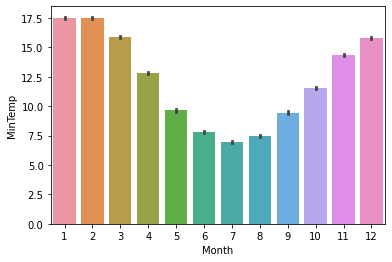
As seen, July (the seventh month of the year) contains the most minimum temperature while January and February (the first and second months of the year) have the least minimum temperature.
Creating Count Plots with Seaborn
Count Plots help to count the number of times a category occurs in a feature and create a barplot based on the results. For instance, in a gender feature, count plots can be used to count the number of males and females in the column and create a bar chart.
To create a count plot in seaborn, the countplot() method is called. This method takes one compulsory feature – the feature that wants to be counted. It is advised that this feature should be a categorical/discrete feature.
In our dataset, say we wish to check how many times the wind is directed to the different zones, we can write the code below.
sns.countplot(df['WindGustDir'])Output:

As seen, the wind mostly flows to the West throughout the 10-year period. Followed by the South East than the North.
In machine learning problems, this plot is useful in checking whether the dataset is imbalanced in a classification problem. Let’s say we wish to check the feature, ‘Rain Today’, to see the number of times it rained and when it did not, we can use the count plot for this purpose.
sns.countplot(df['RainToday'])Output:

If this were a machine learning problem, this dataset can be seen as an imbalanced dataset.
Creating Line Plot using Seaborn
Line Plots are another fundamental plot in data visualization. They are typically used to check how a feature progresses based on another feature.
In seaborn, line plots are created by calling the lineplot() method. It takes two features on the x and y-axis.
Let’s see if we wish to see the temperature at 9 am based on the month of the day, we can create the line plot shown below.
sns.lineplot(df['Month'], df['Temp9am'])Output:

From the plot, we see that the temperature at 9 am is hotter in January and December, and colder from June to August
Creating ScatterPlot using Seaborn
Scatter Plots help to check the relationship between two features. These features must be numerical features. However, it is advisable that there are both continuous numerical features. Barplot should be used when it’s one continuous feature and one discrete feature.
To draw a scatter plot in seaborn, the scatterplot() method is called which takes two compulsory arguments – the two features in the x and y-axis.
Let’s say we wish to create how humidity at 9 am relates with the humidity at 3 pm, we can draw a scatterplot as shown below.
sns.scatterplot(df['Humidity9am'], df['Humidity3pm'])Output:

From the plot, it can be said that when humidity at 9 am is low, it is mostly low at 3 pm and vice versa.
We can make this plot more interesting by checking these data points based on whether it rained or not. To add color codes to a plot, the hue argument is defined.
Note that the hue should be a column with categorical/discrete features.
sns.scatterplot(df['Humidity9am'], df['Humidity3pm'], hue=df['RainToday'])Output:
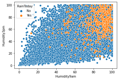
As seen, there is usually rain when humidity at 9 am and 3 pm are both high.
Creating Distribution Plots using Seaborn
Distribution plots are used to show how a continuous feature progresses from its lowest value to the highest value. Examples of distribution plots are distplots, histograms, jointplots, KDE, etc. The good news is that Seaborn can be used to create these visualizations very quickly. Let’s see how to do this.
Creating Histogram with Seaborn
A histogram is a univariate distribution plot that uses horizontal bars to indicate the frequency of values in a feature. It is important to note that the feature must be numerical data, preferably continuous data.
To draw a histogram with seaborn, the histplot() method is called. It takes one compulsory argument – the feature whose frequency is to be measured.
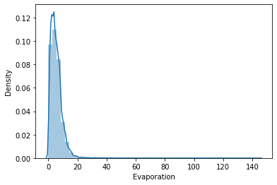
In our data, we can check how the evaporation feature was distributed by plotting the histogram shown below.
sns.histplot(df['Evaporation'])Output:

It is seen that the lowest evaporation value was 0 and the highest around 30. The bulk of the values were however between 0 and 20.
Creating Distplot in Seaborn
Distplots (or distribution plots) are almost like histograms only that this time, a line is drawn on top of the histogram to indicate the overall distribution of the continuous variables.
A distplot is drawn with seaborn using the distplot() method. Since it is a univariate plot, it takes one argument.
For our data, let’s see how the evaporation feature is distributed using a distplot.
sns.distplot(df['Evaporation'])Output:
Creating Joint Plots with Seaborn
A joint plot is a type of distribution plot that shows the relationship between two variables by plotting both the individual distribution of each feature and the scatterplot between both features.
To draw a joint plot with seaborn, the jointplot() method is called. Since it is a bivariate plot, it takes two arguments – the two features whose relationships and distribution want to be plotted.
For our dataset, let’s plot the jointplot between the max temperature and rainfall.
sns.jointplot(x=df['MaxTemp'], y=df['Rainfall'])Output:
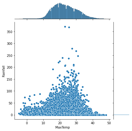
From the plot, it may seem as though, there is more rainfall when the maximum temperature for the day is average (somewhere around 20 to 30). Also, the max temperature feature follows a gaussian distribution where a large chunk of the max temp lies in the center and the rainfall distribution is between 0 and 1.
Creating Pairplot with Seaborn
Pair Plots are bivariate plots that check the relationship between two features using scatterplots and it does it for all the numeric features in the dataframe. In seaborn, it is created by calling the pairplot() method. The method takes one argument, i.e the dataframe.
Seaborn automatically plots the relationship between all the numerical features in that dataframe.
To create a pair plot for our dataset, the code below is used.
sns.pairplot(df)Output:

The plot looks overwhelming since there are a lot of numerical features in the dataset. In a dataset with a few numerical features, a pair plot is a fast way of seeing how these features are related.
Creating Boxplot with Seaborn
Boxplot packs a lot of information in one plot. It helps to visualize how a feature is distributed based on its minimum, maximum, median, lower quartile, and higher quartile range.
- The beginning and end of the box indicate the lower quartile and upper quartile.
- The line in the box indicates the median
- The beginning and end of the whiskers indicate the minimum and maximum values.
Most importantly, box plots can be used to discover outliers in a dataset. Outliers in a box plot are the small circles before or after the whiskers. Detecting outliers and consequently dealing with them in your data is critical before passing the data to any machine learning algorithm as some machine learning algorithms are not robust to outliers.
Boxplot can be created in seaborn by calling the boxplot() method. It takes the one important argument which must be continuous data.
In our data, let’s draw the boxplot for the wind gust speed feature.
sns.boxplot(df['WindGustSpeed'])Output:

As seen from the boxplot, the data contains some outliers since the circular dots are shown after the right whisker.
Creating Heatmap with Seaborn
Heatmap is a plot that shows the intensity of a value in distribution using color codes. You must have seen the heatmap of a player in a football match. Areas, where the player was the most, have thicker colors while areas where it rarely was present have another colour.
In machine learning problems, you can create a heatmap for the correlation among the various features.
The corr() method is used to create a correlation matrix while the heatmap() method of seaborn is used to create the heatmap given the correlation matrix.
The code below shows the heatmap of the correlation matrix of the data using a Red-Blue color map.
sns.heatmap(df.corr(), cmap='RdBu')Output:

From the plot, you can see that:
- Features such as Temp3pm and MaxTemp are highly positively correlated
- WindSpeeed3am and Evaporation are not correlated.
- Features such as Cloud9am and Sunshine are highly negatively correlated.
You can go on and on.
Wrapping up
In this article, you have learned how to use Seaborn to create powerful visualizations in Python with just a few lines of code. You do not have to be concerned about x and y labels, graph title, legends, and so on, and seaborn handle all for you.
In a nutshell, Seaborn is a must-have visualization tool for any Data Scientist and you now have a solid understanding of how to use this great Python library.


